Pentawards, the Oscars of the packaging industry, has released the 2024-2025 Packaging Trends Report, marking the fourth consecutive year Pentawards has released its annual packaging trends report. The Pentawards competition excavated the latest, most innovative, and influential packaging designs from over 2000 entries from more than 60 countries, and summarized ten annual trends in packaging design. They are as follows:
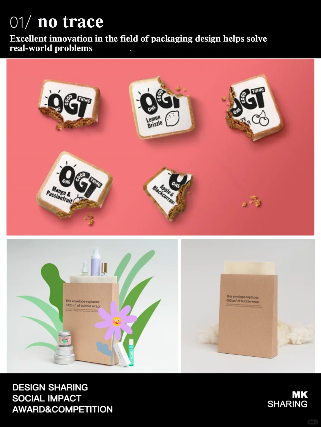
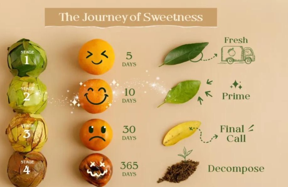
Pentawards proposes that significant innovation in packaging design can help address urgent and critical issues facing the world. In this year's Pentawards entries, designs and solutions that do not leave any product traces or utilize waste materials for reuse have become an important trend to help the world move towards a more circular economy.
For example, Pentawards Diamond Award winner This Way Up collaborated with One Good Thing to create a striking brand image for the brand's edible packaging. It is reported that the design concept of this product originated from a rural cycling trip, and the founder of OGT was shocked by the amount of garbage that destroyed the natural beauty. This completely edible, 100% natural packaging can replace plastic or wrapping paper as a coating for snacks without leaving any traces.
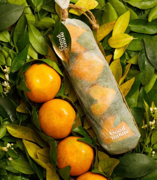
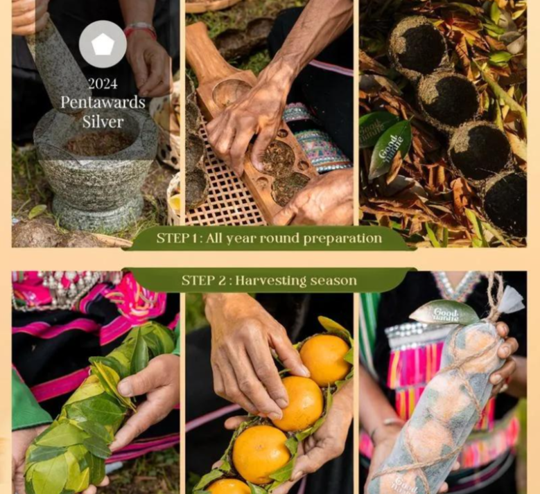
Another design, "The Good of Nature - from Earth, to Earth," is also a packaging design solution aimed at helping the food industry move towards a more circular economy, in line with the concept of sustainable development, and has won the Silver Award for Sustainable Design Food in Pentawards in 2024. It is reported that the packaging is made from fallen leaves from an orange orchard and can also be used as natural fertilizer after initial use.
Pentawards points out that our industry plays a crucial role in the global journey towards a more sustainable future. With the introduction of more relevant regulations and the efforts of various brands to achieve sustainable development goals, there will definitely be more exciting innovative achievements and creative ideas that will help reduce the impact on the environment. We should encourage reuse and recycling, make more use of by-products, and design around a more circular economy.
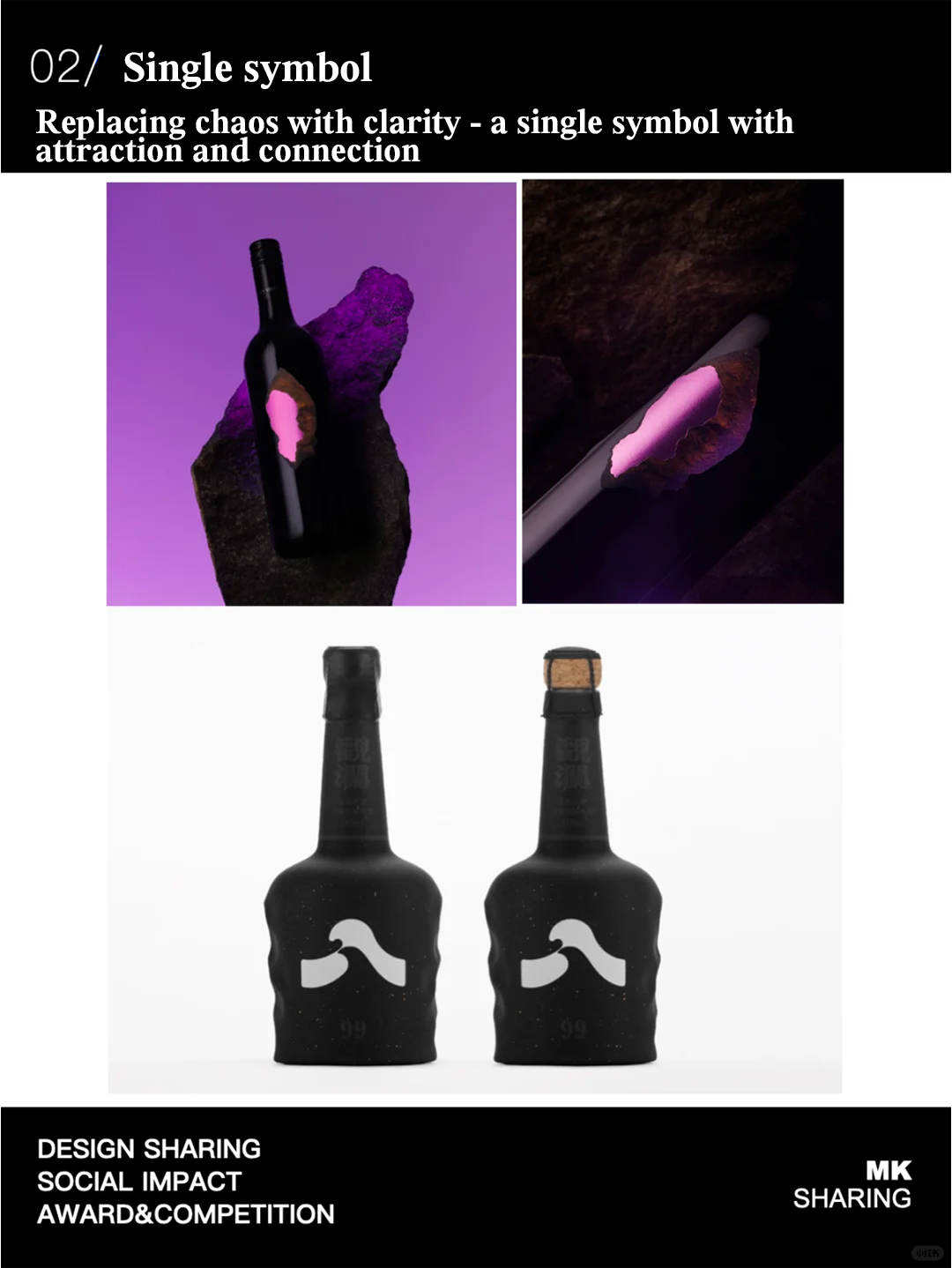
2.Solo Symbolics
Clarity is better than chaos - a striking single visual work can attract (the audience) and establish a connection with them. Pentawards stated that it has abandoned the previous trend of maximizing space through layering and incorporating more carefully crafted visual elements, designs, logos, and copy. "Solo Symbolics" simplifies everything and focuses on one brand identity element. These single symbols, combined with some highly impactful designs, enable brands to effectively convey their own stories, establish lasting connections with consumers, and enhance brand recognition.
For example, Stoney Vineyard's various wines display a rock image taken from the location of the vineyard, which appears to have been "split open" to reveal its internal texture. Pentawards pointed out that Demelza Rafferty's design embodies the confidence of Stoney Vineyard vineyard and the outstanding characteristics of its products, leaving a deep impression and enhancing its appeal on the shelves. In order to complement the matte and embossed texture of the rock image, the design also carefully crafted customized foil colors to create a striking visual contrast.
Kristiina Jaaranen, Brand Director of UPM (UPM), said, "By simplifying the design into a highly influential single brand symbol, we see a bold new direction in the packaging industry. This approach can make the message conveyed more clear, create eye-catching visual effects, and stand out on shelves filled with products. For packaging designers, this is an exciting opportunity to combine minimalist aesthetics with clever material selection, creating both eye-catching shelf display effects and unforgettable brand images
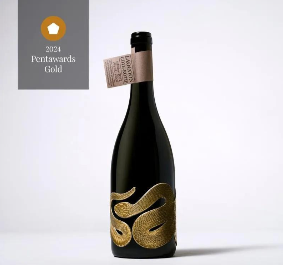
According to Pentawards, the packaging of Laocoon Wine is visually striking and has minimal impact on the Earth's environment. Its main feature is a tribute to the Trojan priest Laocon in Roman mythology, who was killed by two snakes while warning Trojans to be wary of the Trojan horse. This wine showcases how the label has been redefined and elevated to a higher end, with its carved snake shaped decoration surrounding the entire bottle like a piece of jewelry, and entirely made of white tin - a material that can be infinitely recycled, waterproof, and non-toxic. The bottleneck part is made of paper containing recycled fiber components and printed in monochrome.
Pentawards stated that the trend of monocular vision has had a significant impact on the entire beverage industry so far, and its unconventional design concept has attracted widespread attention. In which new industry will this trend stand out next? Given the deeply ingrained concept of reuse, these fashionable designs will not appear out of place even if placed at home for other purposes.
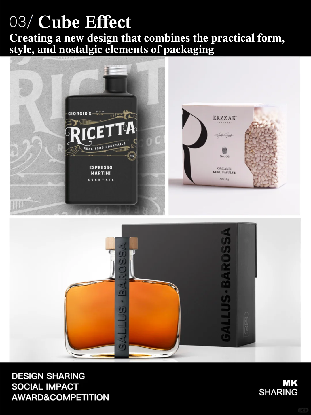
3.The Cube Effect
Pentawards pointed out that although other trends have shown interesting explorations of shapes, the resurgence of cube shaped packaging is particularly noteworthy among various products. In a previous report by Pentawards, it was mentioned in the trend of "Packaging on a Diet for streamlined packaging". Pentawards is excited to see how the new generation of cube packaging leverages current trend elements and builds on its already well-known advantages. The "cube effect" not only allows products to stand out among their peers, but is also highly praised in terms of sustainable development. Due to its shape, it can be transported in large quantities (reducing transportation space waste), allowing brands to reduce their carbon footprint.
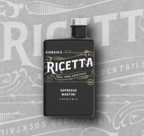
The packaging of Destiny Spirits spirits aligns with this trend. It has introduced a brand new concept that combines traditional Italian cuisine with the most classic cocktail elements. With the help of the Supplystudio design team, Giorgio's Ricetta was born. Its graphic design and packaging elements are inspired by classic Italian cuisine and dining brands, using ceramic straight edged bottle bodies. Its font layout and Art Nouveau style are inspired by some historically rich cocktail bars in Milan and Rome.
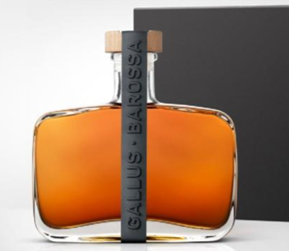
According to Pentawards, Gallus Barossa, the gold medalist in the spirits (dark) category of Pentawards 2024, uses a continuous silicone strip to carry the brand logo on the packaging of her whisky. This is a novel, bold, and slightly stylish way in this traditional category, and the bottle shape is also cubic.
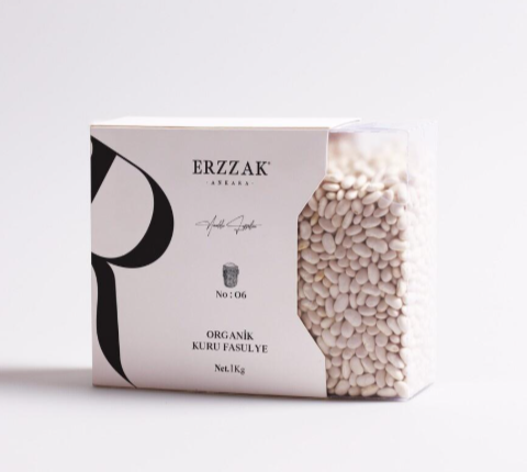
This Erzzak Ankara packaging design, designed by MARK KOCUM, evokes people's nostalgia, inspired by old-fashioned videotapes and their boxes. According to the brand introduction, the internal structure of this packaging is made of organic glass, which meets food storage standards and can be used as an ideal, stylish, and practical container for storing beans. At the same time, this packaging also adheres to the concept of sustainable development and reuse.
The charm of cube shaped packaging lies in its simplicity, "said Graeme Offord, Executive Creative Director of Denomination." It advocates a simple appearance that allows design to be modified with minimal changes. For consumers, this appearance itself is almost indistinguishable from specific product categories, making it like a chameleon that can be flexibly applied to many products and stand out to the fullest extent."
Pentawards looks forward to seeing more cube shaped packaging appear on shelves, as there is no doubt that sustainability will be a key driving force for the brand. In the future, what other shapes of packaging will attract people's attention in order to create more sustainable transportation and supply chains?
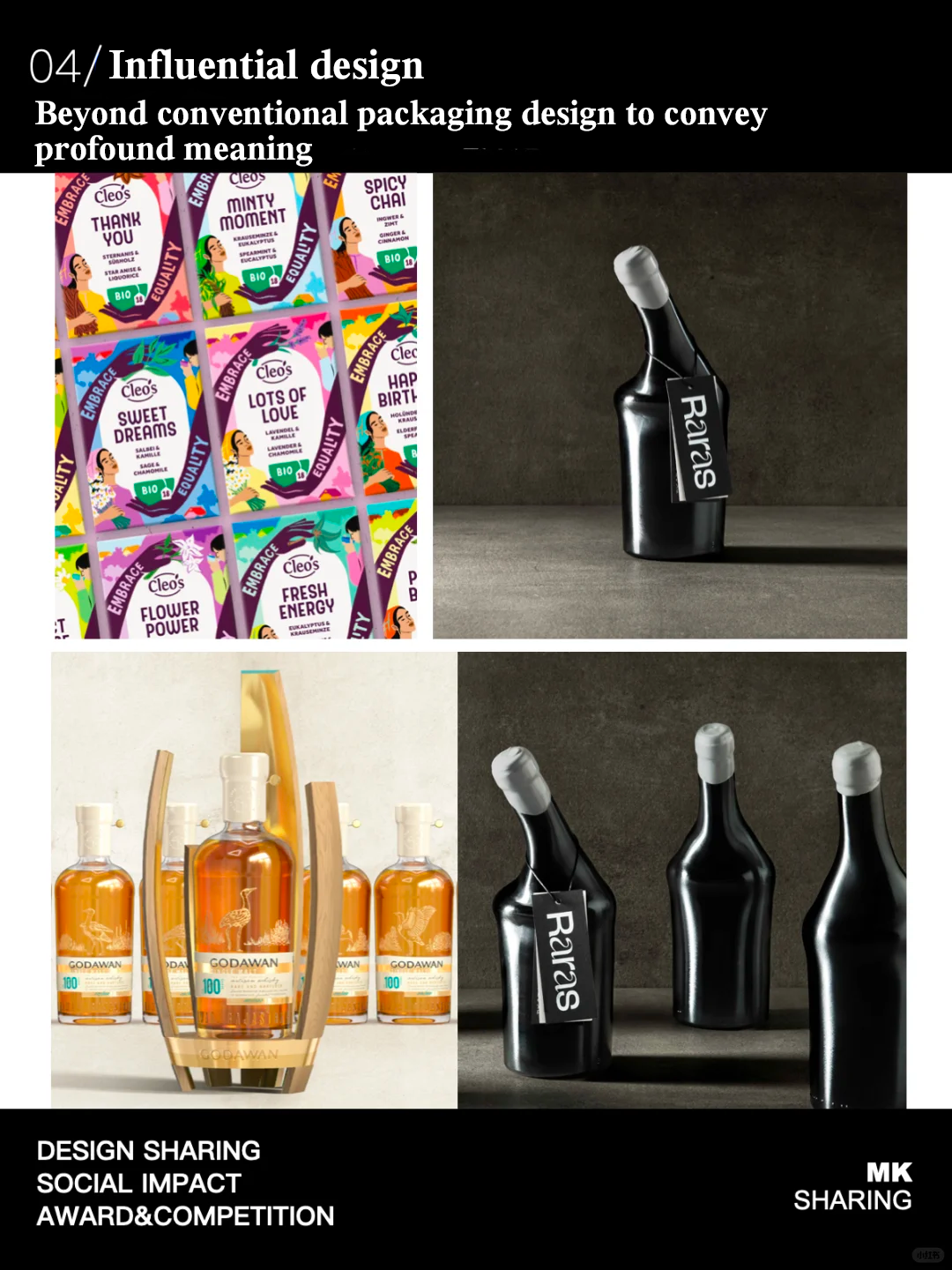
4.Influential Design
Pentawards states that one of their favorite trends is designing how to successfully convey key information, meaning, and values to consumers. Through bold creative strokes that surpass the norms of traditional packaging design, using visual cues or storytelling, material selection, and detail design to create packaging that has a profound impact on consumers.
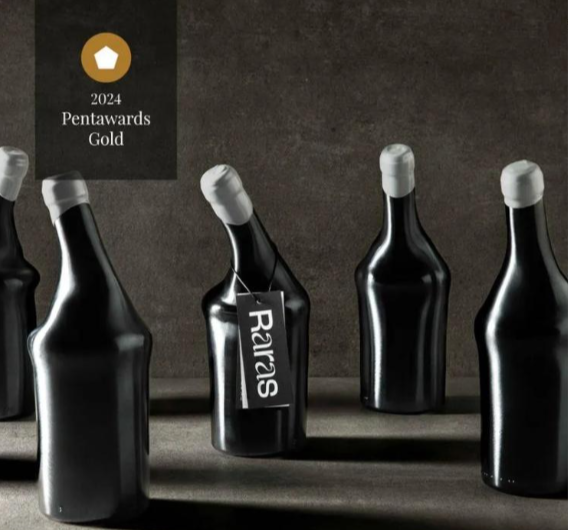
Pentawards pointed out that in this market that emphasizes series, consumers cannot accept bottles with different shapes, but some brands have made breakthroughs. Raras is a limited edition wine with 500 bottles, designed to raise consumer awareness of rare disease research. The unique shape of the bottle, varied layout, and information on the label are all meant to invite holders to engage in a conversation about wine and rare diseases.
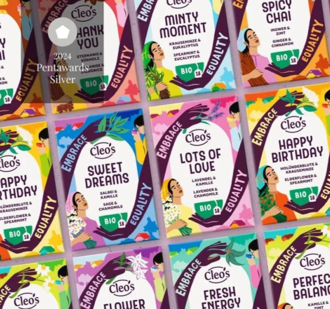
Cleo's Tea and Godawan endow packaging with meaning for humanity, nature, and the environment. Cleo's Tea incorporates many natural elements and iconic illustrations of female pickers into its tea packaging, hoping to raise tea drinkers' awareness through colorful designs and enable them to make more conscious purchasing choices. Pentawards stated that placing this human element in such a prominent position is a groundbreaking breakthrough in tea packaging.
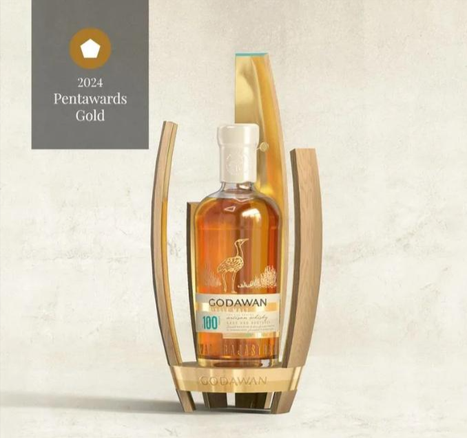
Godawan is India's first single malt whisky, and the Godawan 100 series reminds consumers to pay attention to the challenges faced by Godawan birds by depicting the last living Godawan bird on the packaging.
Going beyond conventions to convey important information, raise awareness, and encourage consumers to make independent purchases truly highlights the impact of packaging on products. Pentawards' marketing manager said in a trend report, "When packaging design breaks through conventions, it already has an impact on consumers. When you combine this with meaningful stories and beautiful details, you have a successful design."
5.Tracing Back History
Pentawards pointed out in the trend report that many brands are now reviving their original elements by redesigning to maximize the use of brand heritage. This trend of nostalgia drives brands to reflect their important historical periods, thereby establishing more emotional connections with consumers.
Pentawards believes that regardless of the ups and downs of redesign, nostalgia will always exist. Establishing a connection with the foundation, values, and heritage of the brand, telling a story and giving the product personality, helping consumers establish a connection with the brand and identify them, thereby giving the brand a certain degree of "iconic status", this trend will continue.
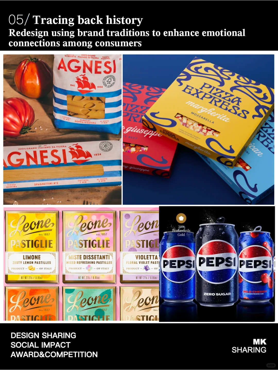
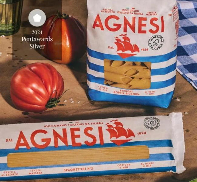
Agnesi, an Italian pasta brand founded in 1824, uses ships as the core of its packaging and prints blue stripes symbolizing waves on the packaging bags, paying tribute to its rich history and showcasing a modern new look.
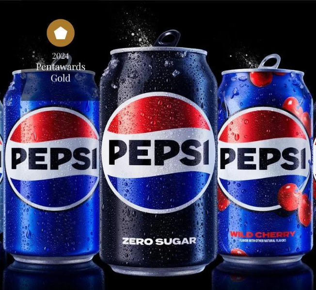
Pepsi Cola has also redesigned its brand logo. In 2023, PepsiCo released its first major brand image upgrade in over a decade, returning to the company's iconic "Earth" pattern center.
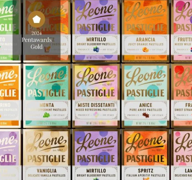
Founded in 1857, Pastiglie Leone is an Italian candy manufacturer. In the process of redesigning the brand, Pastiglie Leone combines a complex product combination full of tradition and nostalgia with fun personality traits, implying a simpler and faster era.
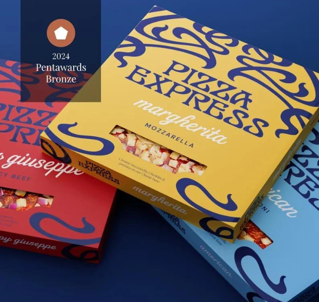
The brand redesign of PizzaExpress highlights jazz and artistic temperament, aiming to reconnect with its iconic image and maintain its dominant position in the pizza industry. Designer Brandon utilized PizzaExpress's most distinctive brand asset - intricate patterns, a new artistic illustration style that captures the brand's artistic roots, while enlarged logos and fonts convey the high quality of handmade production.
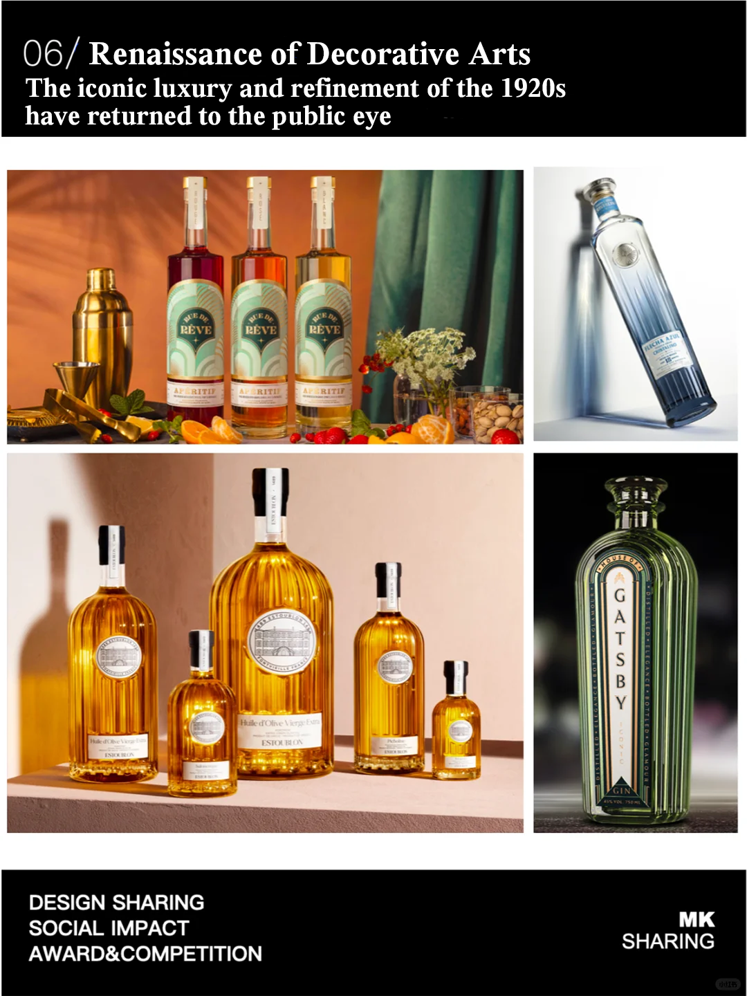
6.Renaissance of Decorative Arts
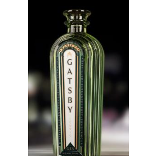
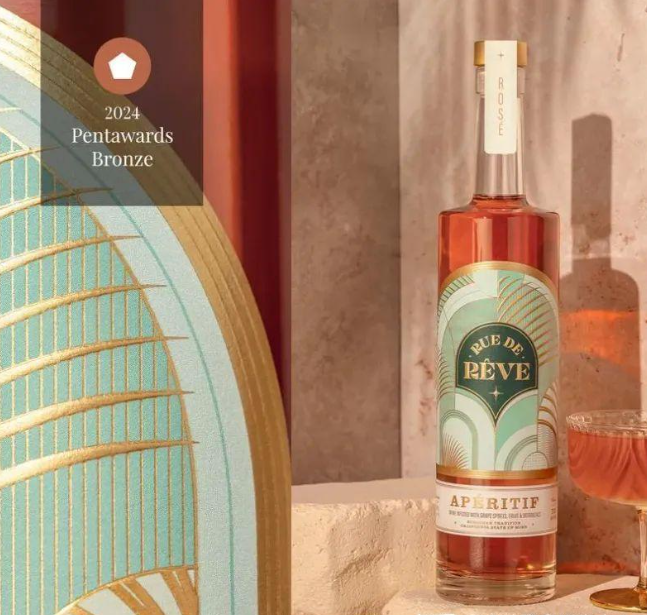
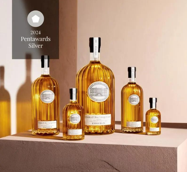
The Pentawards report points out that artistic decorative styles inject new vitality into packaging design with their geometric shapes and luxurious tones. This style originated in the 1920s and 1930s in England and America, characterized by the use of organic lines for decoration. Pentawards believes that this unique combination of geometric structures and gorgeous colors can bring distinctive charm to the liquor industry.
The packaging designed by SCIENCE for House of Gatsby also presents a retro style reminiscent of the 1920s. The packaging of House of Gatsby creates a high-end experience through the fusion of arches and symmetry, while combining modern and traditional materials, exquisite decorations with geometric details, and bold color contrasts.
The packaging design of Rue de R ê ve is inspired by the iconic art deco architecture of Paris in the 1920s and the beautiful scenery of the Big Sur Coast in California. The golden relief design on the packaging not only enhances the tactile effect, but also conveys a "golden mentality", bringing consumers a unique experience.
Estoublon originated from a Provence estate known for producing high-quality olive oil and exceptional wine since 1489, and is a luxury brand symbolizing the art of French living. The founder of Estoublon projected this rich historical heritage into a new, more personal lifestyle focused imagination, and commissioned Servaire&Co to design this new product to inherit this philosophy.
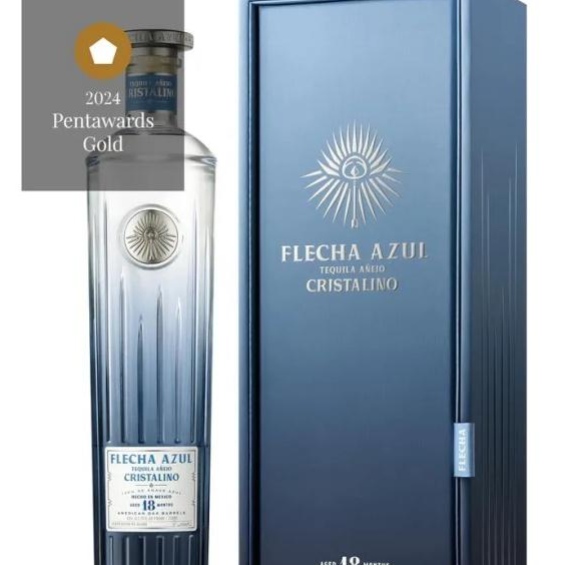
The Tequila bottle body designed by Charmaine Choi for Flecha Azul adopts a ceramic like appearance, reflecting the weight of Extra A ñ ejo Tequila aged for a long time. This packaging bottle has sharp lines and a tall contour, with a gradient of blue symbolizing the clarity of the liquid in the bottle.
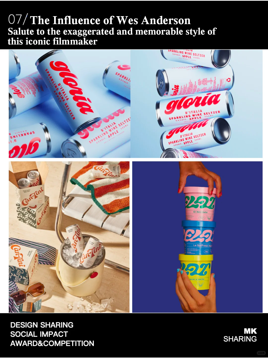
7.The Influence of Wes Anderson
Pentawards believes that packaging design is constantly drawing on diverse inspirations from art, culture, and society. For example, the design style of some products is deeply influenced by American director Wes Anderson (representative works such as "The Grand Budapest Hotel"), presenting a retro yet personalized style. This trend is not only fashionable but also visually impactful. By combining playful fonts, soft tones, and humorous marketing techniques, brands not only attract consumers' attention but also showcase their unique charm. Wes Anderson's visual style is known for its symmetrical composition, vivid color contrasts, and vintage atmosphere. In packaging design, this style is reflected in the delicate attention to details and bold use of colors, creating a visual effect that is both retro and modern.
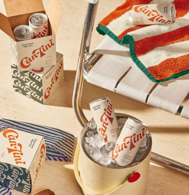
The brand's design inspiration also comes from Wes Anderson's style and the classic temperament of James Bond (a character in 007) in the 1960s. The cream color of the tank and the bright orange color of the logo form a sharp contrast. The logo font is handwritten, and the text lines with varying thickness are smooth, dynamic, and artistic. The layout is simple, without too much decoration, highlighting the recognition of the brand name.
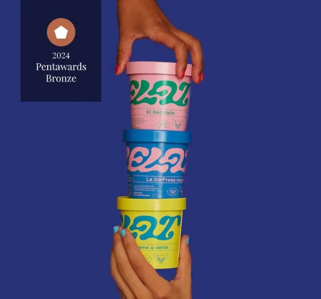
As an emerging ice cream brand, Xelat's vision is to highlight its exquisite craftsmanship in ice cream making and attempt to break the conventions of the traditional ice cream industry, showcasing the brand's uniqueness and innovative spirit. To achieve this goal, Brandsummit design agency has created a vibrant packaging design for Xelat. By using vivid color contrasts, fun font choices, and custom illustrations, these design elements work together to make Xelat's packaging visually both retro and modern.
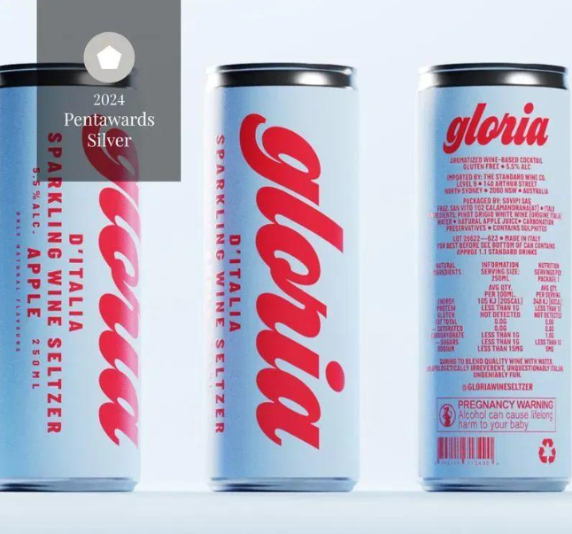
Gloria's alcoholic beverage packaging features a retro Italian style and ice cream color scheme, with the main color scheme being light blue, combined with bright red fonts. The streamlined font and large letter design enhance the visual impact and pay tribute to Wes Anderson's unique aesthetics.
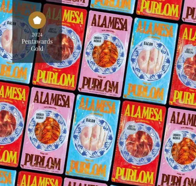
Omni Design is also a design agency for PURLOM LA MESA! The brand has created a set of eye-catching packaging designs. These designs, characterized by their bold layout, rich and colorful tones, and vivid product illustrations, have successfully created an innovative brand image for Purlom in the traditional meat industry.
The packaging uses various bright colors such as red, pink, and blue, which not only make the products more prominent on the shelves, but also distinguish different product lines through color. At the center of each packaging, there is a circular pattern that displays the physical image of the product. This design cleverly combines with the main color tone of the packaging, effectively stimulating consumers' appetite and promoting product sales. Through this design, Purlom showcases its brand's novelty and modernity in traditional industries, attracting consumers' attention and taste buds.
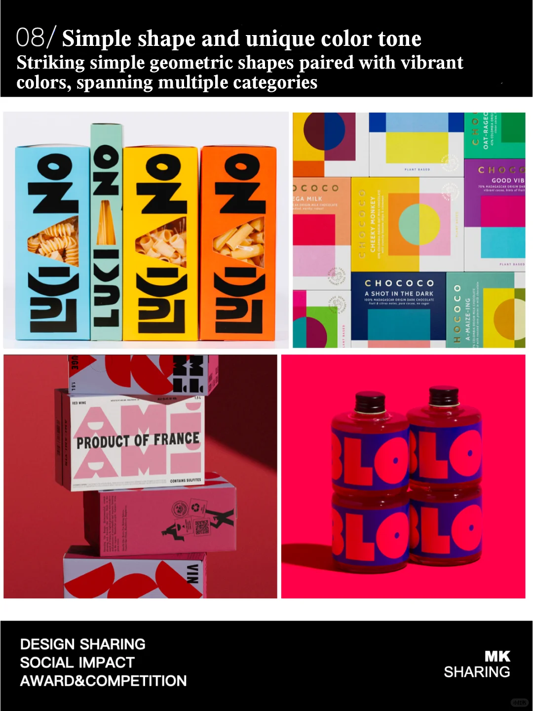
8.Simple Shape and Unique Color Tone
Pentawards has discovered that designers are creating striking visual effects through simple geometric shapes and vivid colors
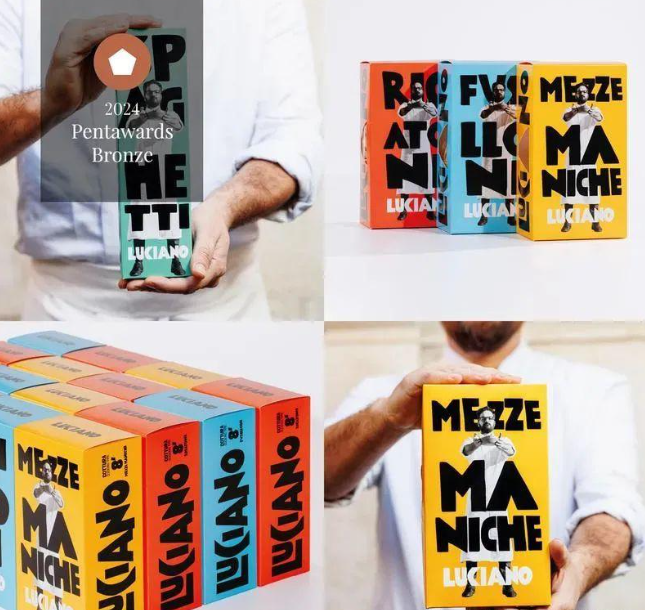
Pasta Luciano's pasta packaging design uses brightly colored packaging boxes, bold and dynamic black fonts, and combines the image of the brand founder in the illustration, making the entire packaging both simple and unique, fully showcasing the vitality and personality of the brand.
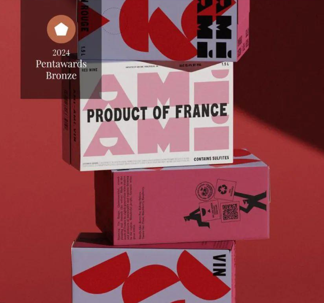
The Ami Ami wine brand is committed to using paper boxes instead of bottles to reduce carbon emissions during transportation. Designer Wedge designed the packaging for it, cleverly incorporating the brand name into the packaging through the use of vivid colors and geometric shapes, ensuring brand recognition and avoiding clutter caused by too many elements. This design technique makes the brand logo itself a decorative element in packaging design, enhancing the visual appeal of the packaging.
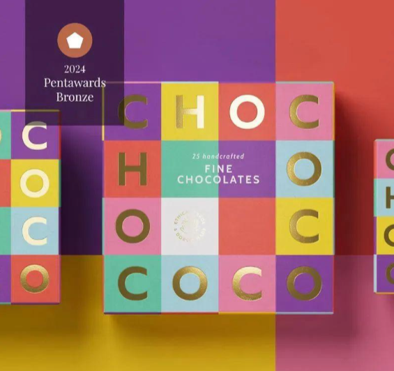
The packaging designed by Buddy Creative for the CHOCOCO brand features geometric patterns and vivid colors, with regular, colorful, and contrasting blocks forming the product's outer packaging. The brand name is divided into uniformly sized hot stamping letters surrounding the packaging, creating a vibrant and consistent collection.
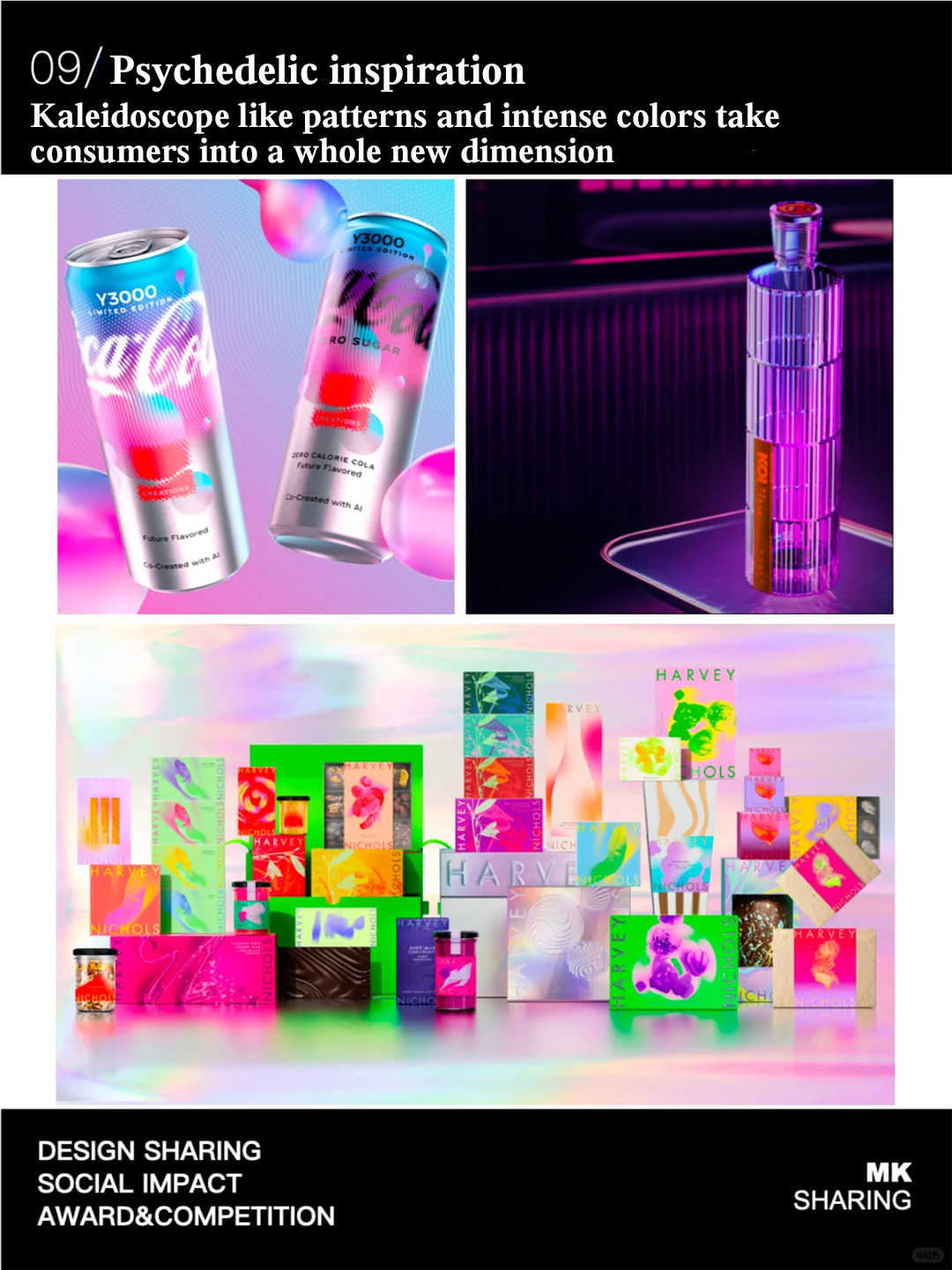
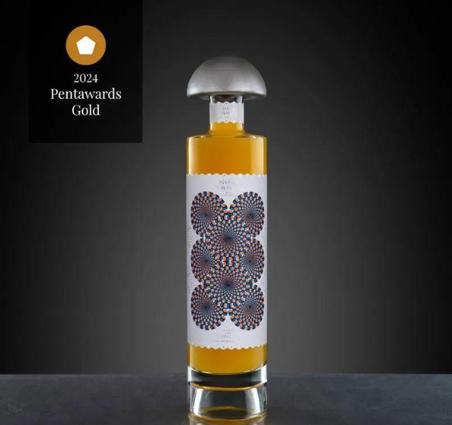
9.Psychedelic Inspiration
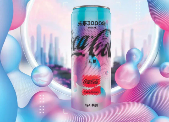
The Pentawards report mentions that brands and design agencies are using psychedelic patterns and colors to convey key ingredients or sources of products, and even help consumers depict future scenes. This trend is in line with the aesthetic of the digital age, and Pentawards expects it to lead design changes in multiple fields, just like Coca Cola's limited edition "Next 3000 Years" product, which will see more designs co created with AI in the future.
This product incorporates AI technology in both research and packaging design processes. From the perspective of packaging design, the brand combines futuristic elements with AI image generators to stimulate the creativity of the main visual. The bubble design on the packaging adopts psychedelic colors, forming the "Le Chuang Wu Jie" logo. The constantly changing liquid forms and color changes in the packaging depict a future scene, while the Spencer font of "Coca Cola" with flowing dot clusters symbolizes the connection between people in the future.
Ni ñ o Santo's juice packaging conveys the characteristics of the product through its psychedelic style design. The entire concept is based on a psychedelic experience triggered by visual illusions, with patterns composed of multiple circles alternating colors of orange, blue, and black, creating an effect similar to visual illusions. The label adopts laser hot stamping, embossing, and die-cutting processes, with a bottle stopper symbolizing these mushrooms as the finishing touch.
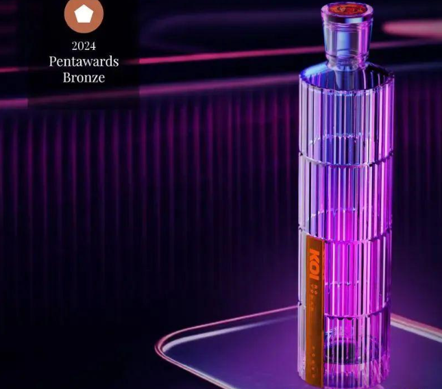
The packaging inspiration for KOI Tribute to Tokyo and its contrasts comes from the skyscrapers in the city skyline, designed by SELENEMO. As night falls, the wine bottle lights up and flashes against the backdrop of music and neon lights, highlighting the brilliance of vodka in the bottle.
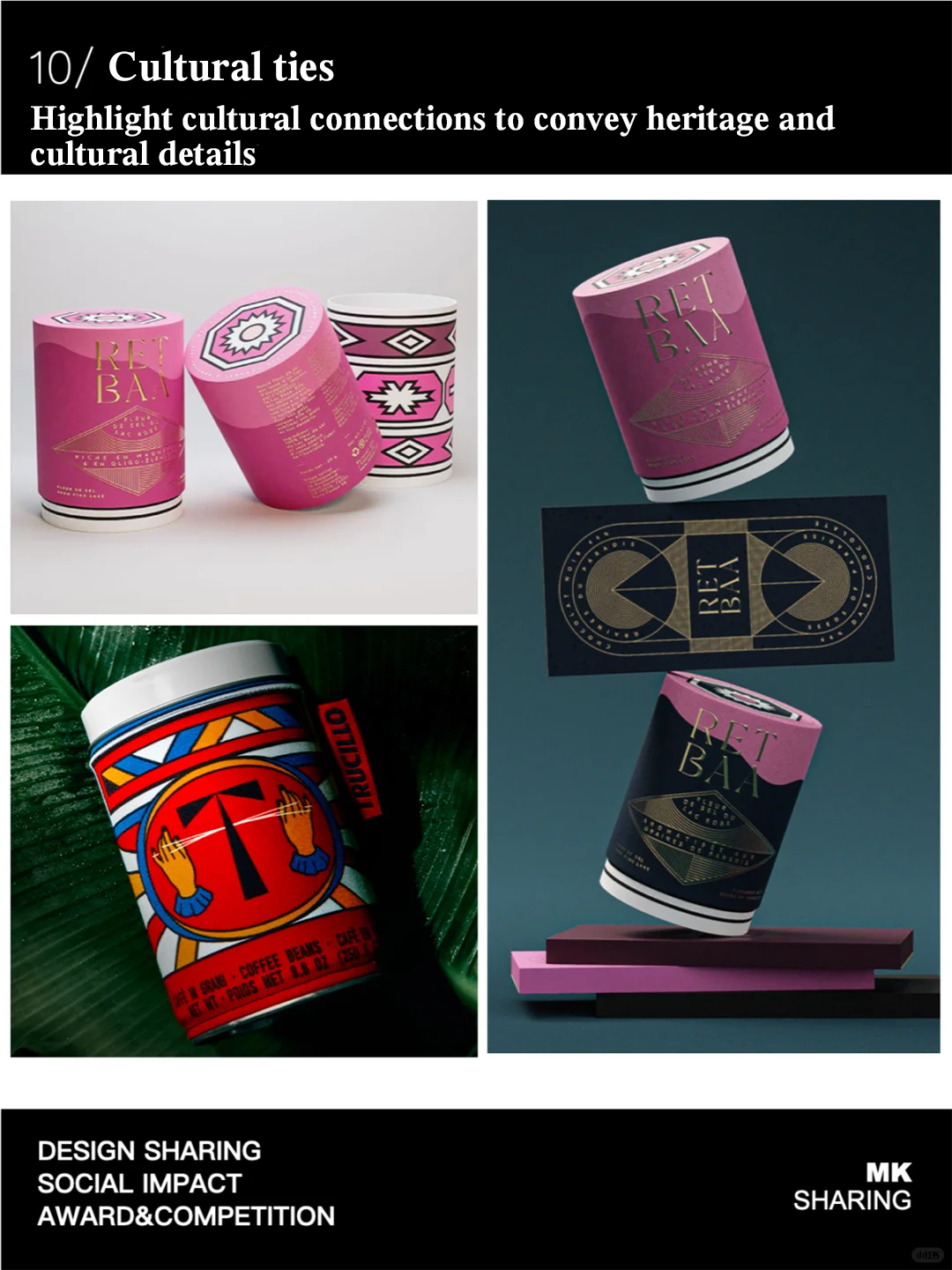
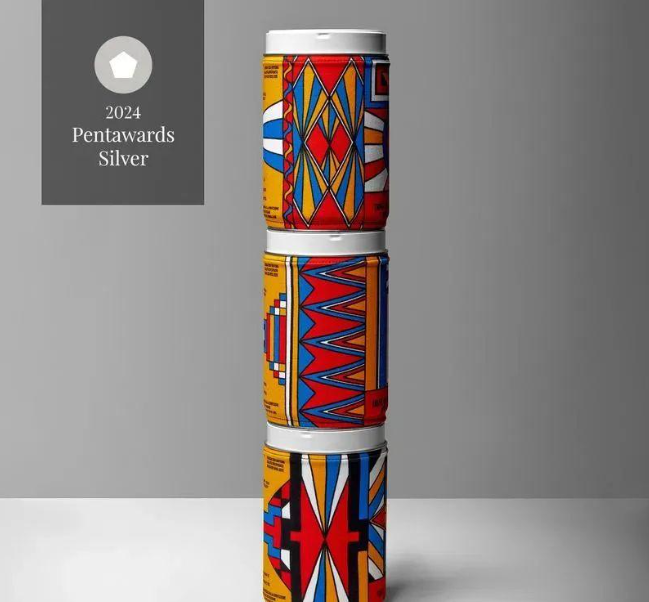
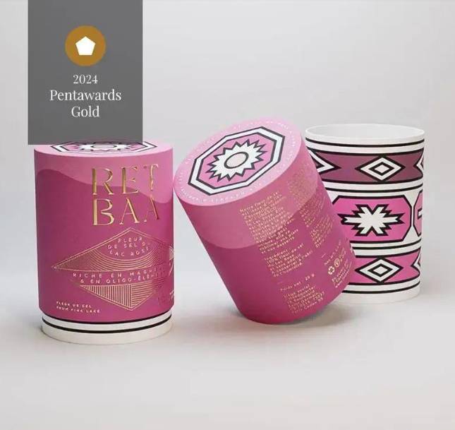
10.Cultural Ties
Pentawards found that cultural influence played a crucial role in this year's entries and was showcased in various ways. This type of packaging design not only showcases profound traditions and historical backgrounds, but also reflects the brand's keen understanding of cultural details in different target markets. Both methods have successfully established emotional connections with the audience, conveying the brand's history and cultural heritage, while also echoing the cultural characteristics of the target market.
The packaging design created by design studio Lettera7 for Trucillo's Estatico collection cleverly blends coffee culture and aesthetic culture. The packaging revolves around geometric shapes and tribal symbols, telling the stories of coffee farmers from Honduras, Brazil, and Guatemala through visual expression. These designs are printed on the packaging, representing and describing the memories and sensory experiences of the design team's communication with coffee farmers from various South American countries.
The packaging design of Sensory Odyssey showcases the stories and cultures of the African continent. Each piece tells a story, paying tribute to the African continent and inviting people to embark on a sensory journey with Parisian charm.
The 2024-2025 Packaging Trends Report released by Pentawards reveals the latest trends in the field of packaging design, while reflecting the profound understanding and positive practices of brands and designers towards social responsibility. The trends presented in the report not only play a key role in the application of environmentally friendly materials, the integration of cultural elements, and social responsibility, but also highlight packaging design as an important link between brands and consumers, with its influence far exceeding visual presentation. These trends indicate that packaging design will continue to lead industry trends and become a key force in promoting social progress and environmental sustainability, thereby shaping a better world.
We are a company specializing in self-adhesive stickers, mainly producing beverage labels, Cosmetic labels , Commodity labels , Food labels , Logistics labels ,Wine Bottle Label, QR code labels, Transferable labels,etc.
If you want to customize stickers, please feel free to contact us!
FAQ
What details required for a quotation?
Please offer the material, size, shape, color, quantity, surface finishing, etc.
How to Make Payment?
We Accept Payment by T/T or West Union, MoneyGram, PayPal, Alibaba Pay Later and So On.
How many days will sample be finished?
We are pleased to offer you sample, usually we arrange them with finished product sample in 5 working days.
Are you a manufacturer or Trading Company?
We are a 100% manufacture specialized in printing & packaging over 20 years.
Can you do the design for us?
Yes. We have a professional team having rich experience in label stickers design and manufacturing.
How does your factory do regarding quality control?
We have professional quality inspector,all the proucts will be 100% checked before the shipment.
Are you a factory or trading company?
We are the direct manufacture with our own factory.
What is the price of shipping?
Depending upon the port if delivery,prices varies.
How could I get a sample?
Yes,free sample after freight paid.
Can you do OEM?
Yes, OEM is available.